Store Employee Tasking App Navigation Refresh
Stakeholders wanted to crowd the homepage with more information. We asked to run a simple test: modernize the nav and let the data tell us what to do.
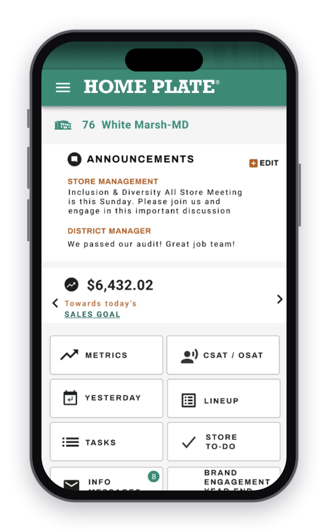
Before — old homepage
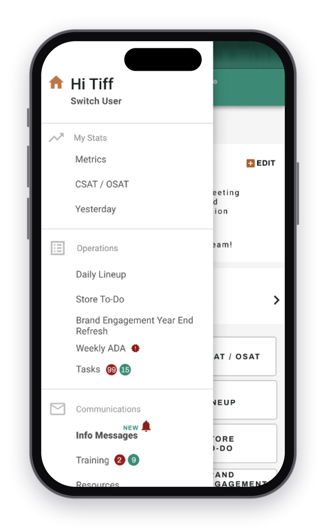
Before — side drawer open
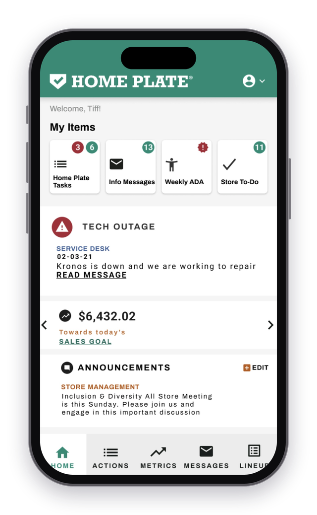
After — new bottom nav
The problem
Store employees used this app every day to work through their tasks. The "Info Messages" feature wasn't getting the views stakeholders wanted, and their answer was to pull it onto the homepage and cram more information up front.
The app was dated overall, but a full redesign wasn't on the table.
What I did
Bottom navigation is the industry standard for mobile apps, so we skipped research. Employees were already familiar with the common pattern and we didn't need to re-prove that. The job was to bring the app up to speed with best practices.
The stakeholders were more set in their ways and didn't want to change things, so the real work was getting them on board. We asked to A/B test on a subset of stores to prove the proposal.
- Pitched a bottom nav in place of the side drawer, with a hypothesis that traffic to the buried features would rise on its own
- Ran an A/B test on a subset of stores, which showed a positive signal
- Got stakeholder approval and rolled the new nav out to all stores
- Designed the visual refresh of the nav only, leaving the rest of the app alone
- Coached a designer through the work as Senior Designer
The outcome
These numbers come from after the bottom nav rolled out to every store, compared with before.
The decision
A positive signal from the test was enough to drop the homepage plan.
Stakeholders wanted to fix the Info Messages problem by adding more to the homepage. We proposed changing only the navigation and testing it first. The test on a subset of stores showed a positive signal, and stakeholders approved the nav refresh instead. We rolled it out to all stores, and usage went up across the board.